
Web design represents your business online. After all, isn’t your digital marketing all about promoting links back to your website and encouraging visits to your website? And once everyone’s there ogling your logo and everything, what will they think about you?
- Is your brand plain and minimal?
- Are you intentionally rough or un-polished?
- Is your brand fussy and buttoned up?
- Would someone call you bold and fierce?
- Maybe you’re a mix of everything: fussy, bold, fierce, AND minimal.
Let’s explore web design ideas to show off your personality in six areas: fonts, photos, colors, illustrations, copy, and design accents.
Choose Fresh Fonts
I think your choice of fonts is one of the easiest ways to show your personality. It’s kind of like picking out your favorite dinnerware at Target. They’ve got plain white dishes that go with every decor and every food. Or pick something densely patterned and best suited to refined dishes. You might even be the type to go for a mismatched set where somehow nothing and everything goes. Show me your favorite dishes and I’ll know something both about your personal style and about your personality. I’ve taken screenshots of free fonts available from Google to try and show how a few different fonts styles reflect different personalities.
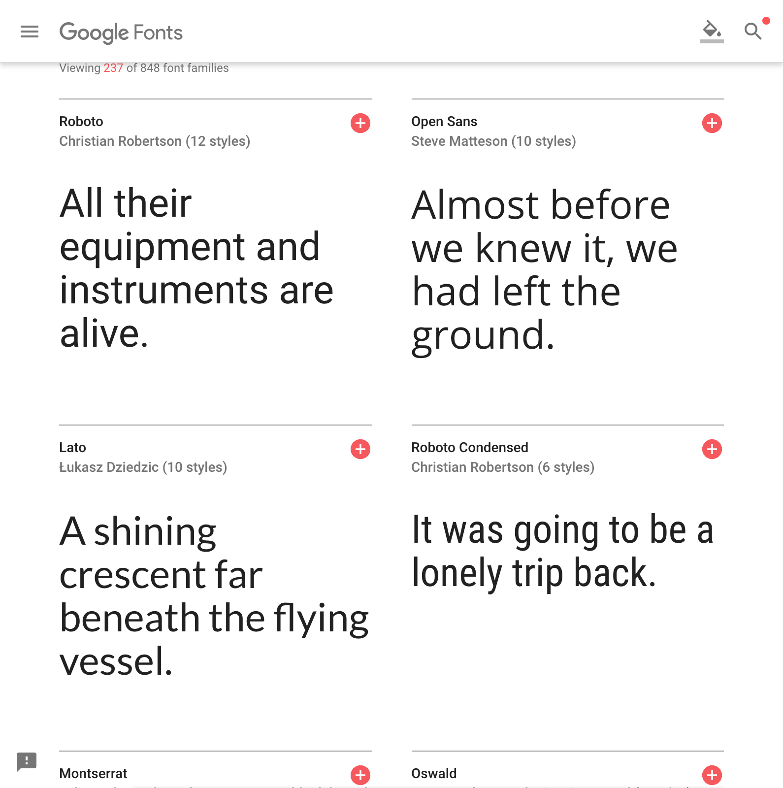
Plain fonts like Roboto and Lato are beautiful in their simple, crisp communication. They are best used for large chunks of text, but a skilled designer can turn even a plain font into a high-end looking logo.
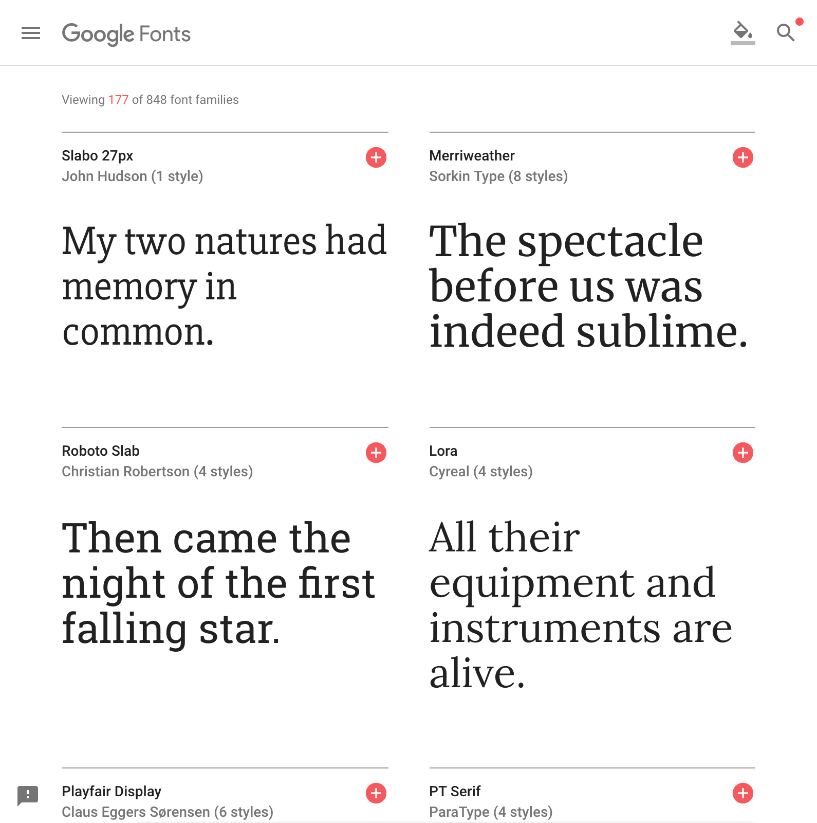
Serif fonts have tails on the ends of letters and work for a classic, dignified look.
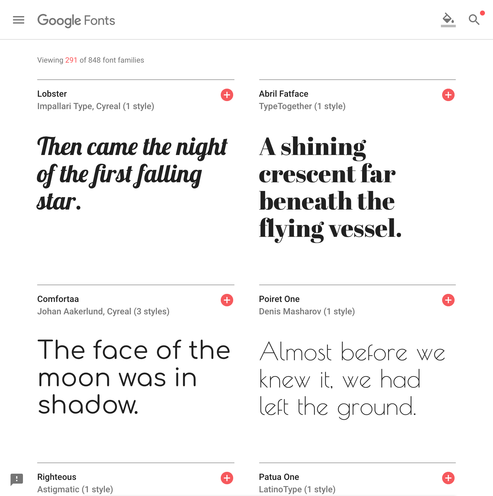
There’s also a category called “display fonts” that are best used only for logos and special occasions.
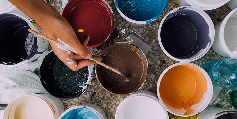
Keep a Consistent Look With Your Photos
One of the keys to a polished-looking website is creating consistency with your photographs. It’s easy to spot stock photos when they look different next to others on your website. If you’re stuck using stock images, sometimes you can find multiple related photos from the same photo shoot, so they at least have similar lighting and finishes. Check out a collage of different hip photo styles I found by browsing the free photo site unsplash.com.
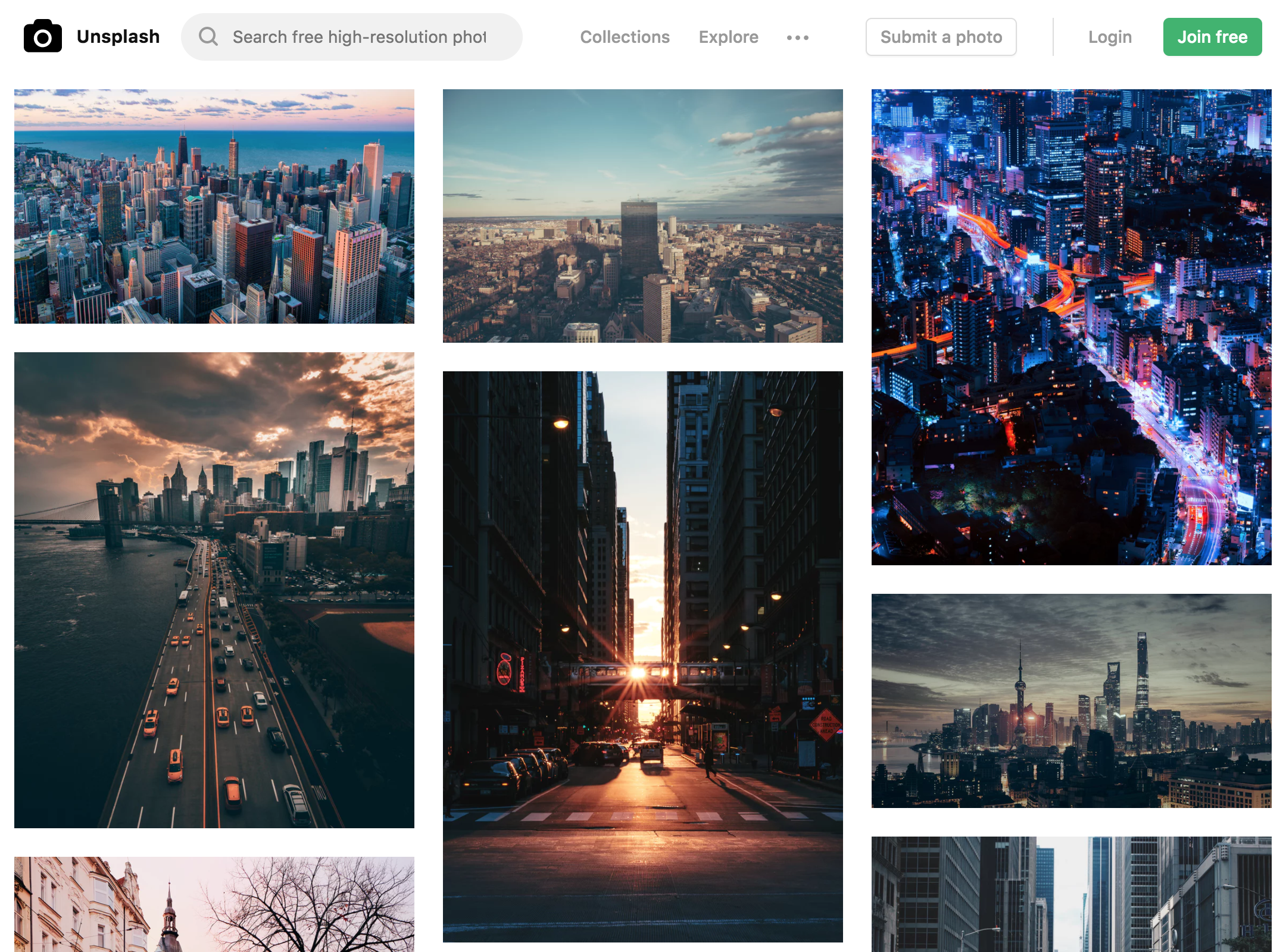
Some of these images are heavily edited, others look very natural. Some emphasize bright lights while others are intentionally calm and muted. And it’s ok if you’re not quite sure how to describe your style! I often use basic terms like warm and cold, dark and light to describe image styles too.
Even if all your photos are originals you shot yesterday, take time to use a simple photo editor to tweak brightness and contrast on each so they’re consistent. When you stand back and look at the set all together, there shouldn’t be any standouts. Be wary of using cheap-looking photo filters that artificially add sepia tones and “fun” looks.
When you choose a consistent look in your photos, you can work on making it unique to you and truly own it by using it on everything. Of course, when you need to break your own rules, use a different look to make a photo immediately pop.
Pick Your Colors Carefully
Aside from your font choice, colors are the obvious way to let your personality shine through. Colors are an important element of your brand that are critically important to designing your website. This is especially true in today’s wave of minimalist web design. Since many designs are simple blocks of text with different colored backgrounds and reduced reliance on images, your fonts and colors have to be very strong.
Hopefully you already have an idea about which colors to use based on your logo and branding guide. As a web designer, I love to have a guide for which of your colors should be used often, for many purposes, which should be used sparingly and exclusively for buttons or high priority messages, and other rules of thumb.
For help choosing your colors, try consulting a color theory guide. Color theory assigns different meanings to colors to help you choose colors that create the reactions in your customers you desire. Blue is often associated with calm and trustworthiness. Red is exciting and eye-catching, but also signals danger, which could work if you’re a hot sauce brand. Or if your product is red, like tomatoes or red wine, picking an appropriate shade of red is a no-brainer. If you chose blue, however, you run the risk of all the doctors and lawyers who use a lot of blue. If that all sounds crazy to you, good news! There’s plenty more color theory to be found with Canva’s in-depth color theory article.
Illustrate Your Pages
One of my favorite web design predictions for 2018 is the increased use of illustrations in web designs. In places where a photograph might been used, expect to see cutting-edge brands using custom drawings, digital illustrations, even animations. Your personality can shine through in the illustration style you choose.
Try thinking about smooth lines for a bold, modern look. Thin, smooth lines look elegant and expensive. Will you round all your corners for a friendly, humanist feel? Or sharpen every angle to a precise and impactful point?
Speak With Your Own Voice
Our copywriters at Roundpeg will tell you the best way to share your personality with the world is by writing about it. Develop your unique brand voice and use it for all of your headlines and body copy! Voice is the special quality that makes a block of text content your content. Start developing a voice for your brand by looking back on your existing social media posts or other previously published work and identify similarities in the style. Look for the words you choose to use and choose those you avoid, the length of sentences, the use of contractions (or not), and anything else that sticks out.
Another way to experiment and identify the elements of voice is to edit someone else’s text to make it sound like you. Look at how you marked up and edited the document for clues to your own voice.
Deliberately Sprinkle Design Accents
What other graphics go with your brand? Notice that I said brand, not logo. Many beginning businesses focus heavily on getting their new logo design and basic colors chosen. Fast forward five years and a web designer working on a new site just has a logo and 2 colors to work from. A complete brand is a more nuanced, complete set of communication tools that includes everything we’ve been discussing here in addition to something I’m going to call accents.
Web design accents are additional graphic elements inspired by the logo. They are used to wrap content in a consistent branded message without repeating the logo excessively. Think of little underlines, an expanded color palette, or a custom set of icons. Use web design accents to thoroughly mix your personality into every page.
What’s your personality like? Could I accurately describe it just looking at your web design?


